[Review] “The Flash” #763
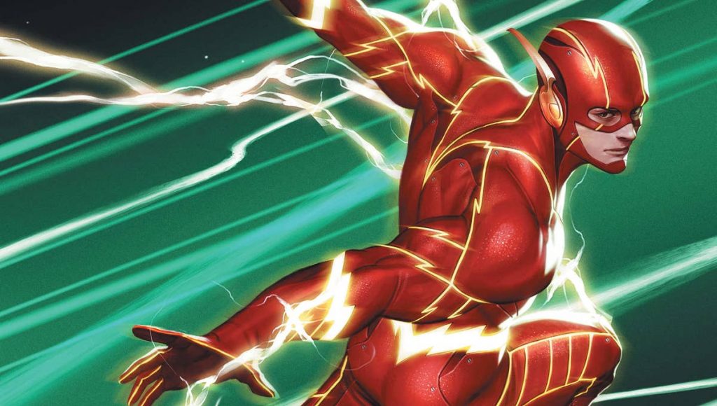
This issue of The Flash kicks off a fresh start for the series as we welcome in new writer Kevin Shinick and artist Clayton Henry. These two are set to take over for the foreseeable future and they begin with a really solid debut issue.
Nothing big happens in this issue, but it does give us an idea of what we can expect to see in Shinick’s first story arc. In this issue, we see Barry and Iris enjoying a day at the farmers market. Barry eventually realizes his ring is missing and has Iris help him look for it. Barry eventually discovers The Trickster swiped it off him and gets put through a series games to try and get it back. Like I said, nothing major happens.
Honestly, this is almost exactly what I was expecting from Shinick’s debut issue. Nothing major happened and it gave us a good look at Shinick’s style. I’m looking forward to the next issue and seeing how well he can develop his stories as I am unfamiliar with his work. He paced this issue nicely, it seems like having The Flash look for a ring would be pretty easy, but he put a nice twist to that. We do get a little more backstory on The Flash’s ring. The ending was good and I can’t wait to see where he takes the story from there.
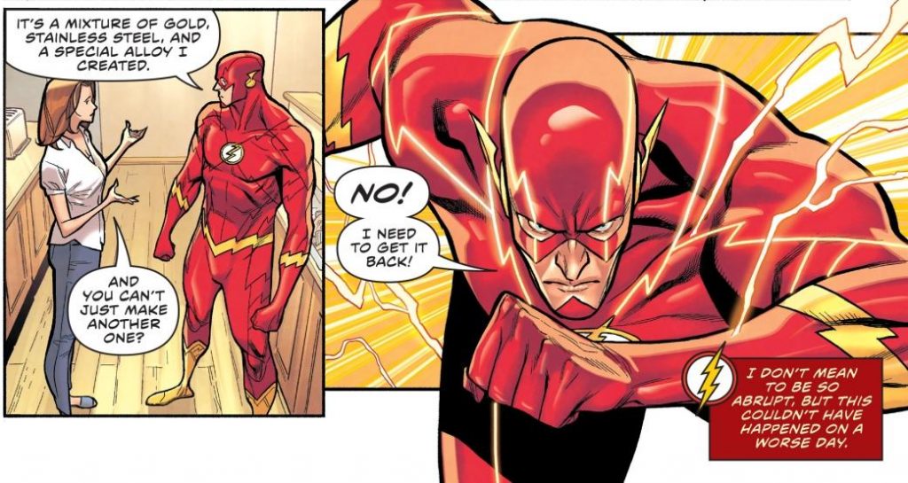
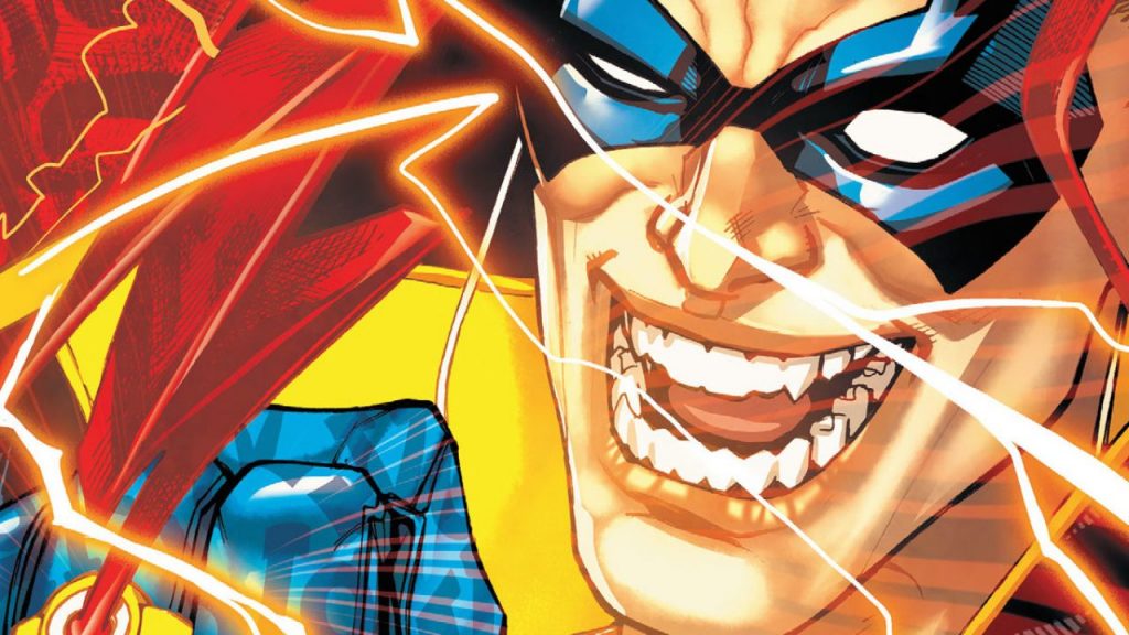
Clayton Henry’s art was solid and I couldn’t find anything about it I didn’t like. Since this is Henry’s and Shinick’s first issue together, I am expecting some stuff to change art wise; nothing major, but as they develop these characters and work more together, we could see some changes down the road. Henry was good with showing the emotion in his characters, and I think that’s important when it comes to drawing superheros or any character in general; in my opinion, I think it helps develop the story. Overall, I was impressed with Henry’s work on this issue. Hopefully later on in this series he gets to put his own unique design onto The Flash’s suit. I loved how Howard Porter drew the suit, but with the series getting a new team, I wouldn’t be opposed to Henry putting a fresh new touch on the suit.
The panels fit together nice and smooth. There was no confusion on where you should be reading next or where to look. Steve Wands did amazing with the lettering as always and it was nice to see him stay on the series.
Overall, this was a really solid debut issue for Kevin Shinick and I know I’m looking forward to more issues written by him. I also looking forward to seeing the chemistry between him and artist Clayton Henry. Sometimes if a writer and artist aren’t on the same page, it can ruin the story. Thankfully we don’t see any hint of that in this issue, but it’s also their first issue together, so we can only wait and see how this goes.
